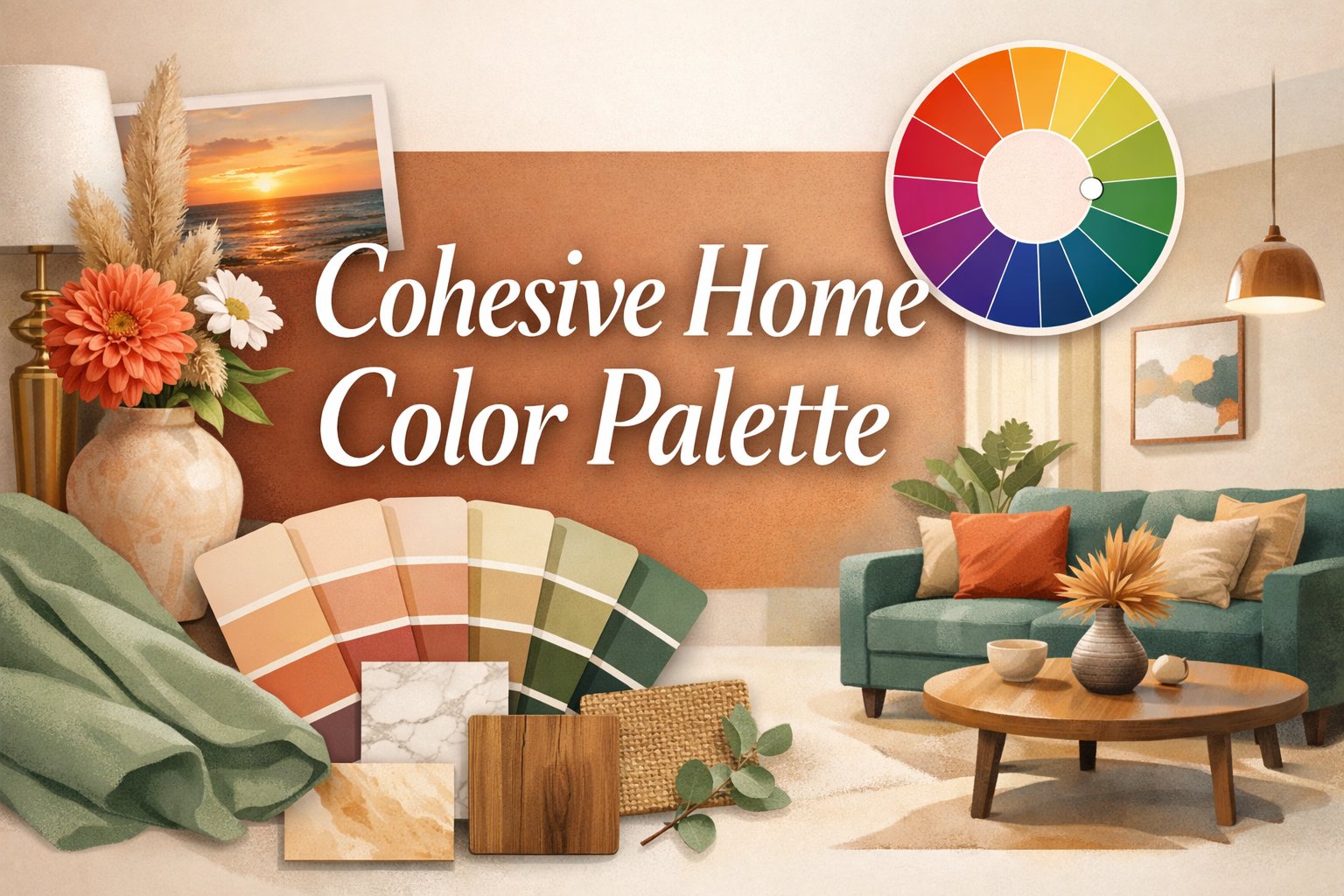
Creating a cohesive home color palette doesn’t have to feel overwhelming. While many homeowners find themselves selecting colors randomly from room to room, the secret to achieving a beautifully curated interior lies in drawing interior design color inspiration from a single source. This strategic approach transforms scattered color choices into a unified, thoughtful design story.
The Power of One: Building Your Color Foundation
Leading interior designers understand that the most successful color schemes begin with one inspirational element. Gray Walker of Gray Walker Interiors consistently applies this principle across her projects. “I always start off with one thing,” she explains. Whether drawing inspiration from a client’s mother’s coral lipstick paired with navy clothing or a vibrant artwork, this focused approach creates design clarity.
Art as Your Color Guide
Artwork serves as an exceptional foundation for developing a cohesive home color palette. Walker recently completed a Georgia residence where a colorful painting became the cornerstone of the entire design scheme. She extracted blues, greens, and pinks from the artwork, varying their intensities throughout the home.
In the dramatic double-height foyer where the painting hangs, she chose neutral walls complemented by a Stark Carpet Missoni runner that incorporates all the painting’s colors. This approach demonstrates how one piece can seamlessly connect multiple spaces.
Expert Strategies for Color Cohesion
The Color Family Approach
Andrea Magno, Benjamin Moore’s director of color marketing and design, advocates for building palettes around one to three adjacent color families on the color wheel. This technique offers several advantages:
- Brings clarity to the selection process
- Simplifies decision-making
- Creates personal meaning in your spaces
- Ensures smooth room-to-room transitions
“By layering light to dark variations within these families, you can achieve smooth transitions from room to room and create a cohesive, thoughtfully curated color story,” Magno explains.
Creative Interpretation Over Literal Translation
Aymee Kuhlman and Katherine Cunningham of Light and Dwell demonstrate sophisticated interior design color inspiration in their Mexico family home project. They anchored their palette around an oil portrait featuring a man crouching before a citrus tree, but they interpreted rather than copied its colors.
The designers extracted earth tones from the painting’s ground elements, translating them into Mexican rammed earth kitchen tiles. They referenced the subject’s shirt texture and color through white plaster walls in the en-suite bathrooms, proving that inspiration can be conceptual rather than literal.
Nature-Inspired Palettes That Work
Capturing Natural Light
Leatrice Eiseman, executive director of the Pantone Color Institute, frequently draws interior design color inspiration from natural elements. For her former Seattle home, she wanted to create perpetual sunlight despite the region’s cloudy climate.
Eiseman photographed light sparkling off Puget Sound during bright days, then matched that luminous quality to Pantone Cornsilk 13-0932. This approach brought consistent warmth to her interior spaces.
Balancing Warm and Cool Tones
For her current Tucson residence, Eiseman built a cohesive home color palette around sunset hues—light peach, purple, and magenta—balanced with cooling turquoise accents. Her philosophy emphasizes including touches of opposite color wheel elements for visual harmony.
Muted Natural Schemes
General Assembly’s Colin Stief created a serene palette for an Amagansett beach bungalow by matching the interior to its natural surroundings. The unspoiled greenery, dunes, shrubs, and pine trees inspired a muted approach featuring neutral walls with one or two accent colors per room.
Bold Approaches to Cohesive Color
Garden-to-Interior Translation
New York designer Sasha Bikoff proves that nature-inspired palettes can be vibrant and dramatic. For a New Jersey home, she based her interior design color inspiration on the clients’ garden flowers, assigning each room a different floral hue:
- Foyer: African violet for bold, regal grounding
- Living Room: Rose pink for warmth
- Dining Room: Daffodil yellow for energy
- Office: Grass green for tranquility
- Powder Room: Tulip red for dramatic impact
Bikoff used high-gloss oil paint from Fine Paints of Europe for intensity while keeping trim white to highlight original woodwork and provide visual breaks.
Conceptual Color Stories
Noz Nozawa of Noz Design created an extraordinary cohesive home color palette for a San Francisco family inspired by rainbows. This choice reflected both LGBTQ+ cultural symbolism and the clients’ love of color.
The implementation included:
- White foyer walls showcasing a custom rainbow runner and geode-inspired mural
- Deep pink living room walls with rainbow rugs
- Blue dining room with orange accents
- Hot pink mudroom refrigerator
- Kitchen windows in different hues creating a cumulative rainbow effect
Key Takeaways for Your Color Journey
Start Small, Think Big
Begin your cohesive home color palette journey by identifying one meaningful element—whether it’s artwork, a cherished photograph, a favorite textile, or a natural scene that speaks to you.
Layer Thoughtfully
Once you’ve established your inspiration source, extract multiple colors and vary their intensities throughout your home. This creates visual interest while maintaining cohesion.
Trust Your Vision
As Bikoff emphasizes, “Do not fear color.” The right mix of hues helps your home tell your unique story while creating spaces that feel intentionally designed rather than accidentally assembled.
Creating Your Personal Color Story
Remember that developing a cohesive home color palette is ultimately about creating spaces that reflect your personality and lifestyle. Whether you’re drawn to subtle, nature-inspired neutrals or bold, artistic statements, starting with one inspirational element provides the foundation for confident color decisions.
The most successful interiors feel curated and intentional, not haphazard. By anchoring your interior design color inspiration in something meaningful to you, every room becomes part of a larger, more beautiful story that unfolds throughout your home.